Visual Discovery
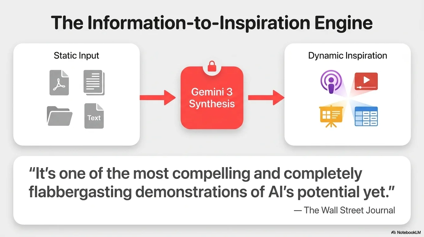
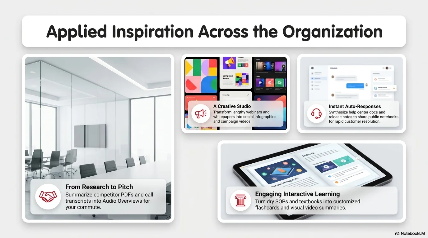
Focuses on visual-first layouts, card-based components with high border-radius, and vibrant red accents to drive engagement and focus. Inspired by modern discovery feeds.
Palette
- Primary
#E60023 - Background
#FFFFFF - Text
#111111
Typography
- primary heading
- Clean rounded sans-serif (e.g., Roboto, Helvetica Rounded), bold
- secondary heading
- Simple sans-serif, medium weight, clean
- body text
- Functional sans-serif, standard weights, high contrast on white
Key visual elements
- Rounded corners (16px to 24px) for cards and images
- Drop shadows for depth
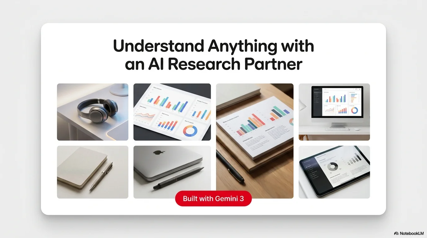
- Grid-based image distribution
- Circular profiles and 'save' style button call-outs
YAML
design_system:
  global_style:
    theme: "Modern, visual-first, and organized. Inspired by card-based discovery aesthetics. Uses card-based layouts with high border radius, soft shadows, and vibrant accents."
    typography:
      primary_heading: "Clean rounded sans-serif (e.g., Roboto, Helvetica Rounded), bold"
      secondary_heading: "Simple sans-serif, medium weight, clean"
      body_text: "Functional sans-serif, standard weights, high contrast on white"
    color_palette:
      primary_color: "#E60023" # Vibrant Red
      background: "#FFFFFF"    # Clean White
      text_main: "#111111"     # Carbon Gray
      accent_color: "#EFEFEF"  # Ultra Light Gray
    key_visual_elements:
      - "Rounded corners (16px to 24px) for cards and images"
      - "Drop shadows for depth"
      - "Grid-based image distribution"
      - "Circular profiles and 'save' style button call-outs"

  image_generation_prompts:
    style_guidelines: "Clean white studio background, vibrant accents, rounded corners, drop shadows, flat design elements, organized grid."
    themes:
      - target: "Abstract Grid"
        prompt_elements: "Minimalist grid of colorful lifestyle photos, rounded corners, white gutters, soft drop shadows."

slide_layout_templates:
  - type: "Cover_Discovery"
    usage: "Impactful intro slide"
    components:
      - "Layout: Large central image with extremely rounded corners"
      - "Text: Bold title in primary color centered at the bottom"

  - type: "Card_Grid_Insights"
    usage: "Presenting multiple features or items"
    components:
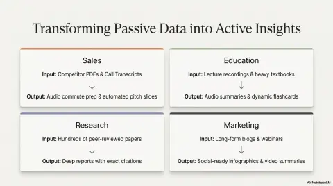
      - "Layout: 3-column grid of rounded cards"
      - "Components: Each card has a small icon + Bold sub-heading + Short description"

  - type: "Masonry_Vision"
    usage: "Inspiration or mood board"
    components:
      - "Layout: Asymmetrical masonry grid of images"
      - "Overlay: Semi-transparent white labels with dark text"





Connect & Share